Erin Go Bragh!

This is a Throwback-Thursday post to celebrate Saint Patrick’s Day. Below are a series of vector clip art graphics I created for sale at Getty Images/iStockPhoto. Not much more to say about them, other than each is available for purchase, if interested. If not, feel free to simply browse and enjoy. As always, comments are welcome, and be sure to follow me to stay up to date on all things Mike!

Leprechaun_Karaoke

Leprechaun Karaoke

Billiards_Leprechaun

Leprechaun Billiards

Pot O’ Gold, Baseball, or Kickball

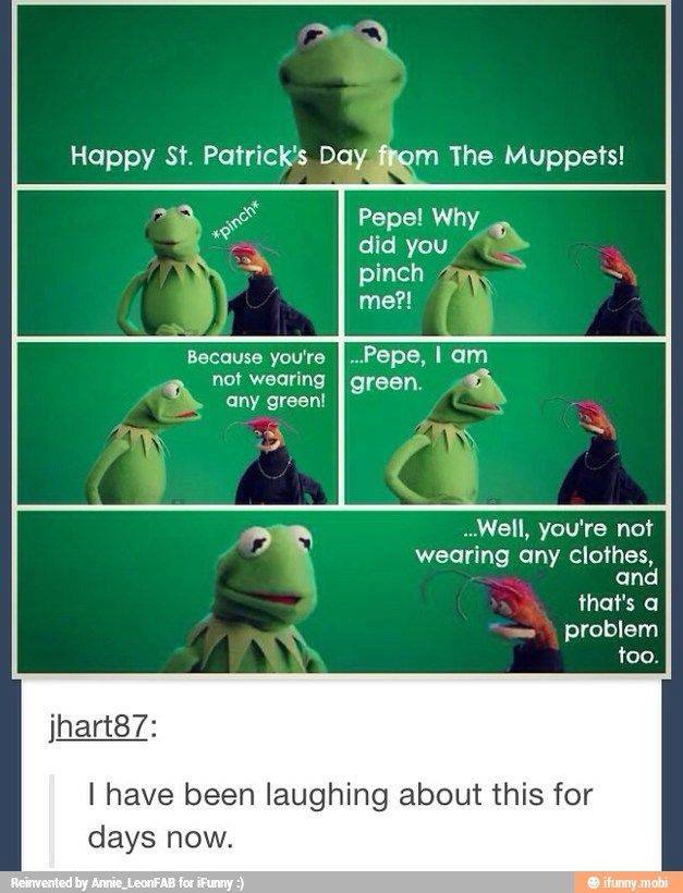
That’s it for today! No, wait, I saw this earlier this morning, and had a good laugh, so, enjoy. I’m not the creator, I’m just sharing the wealth:

661_1055680951159366_5320159632080786655_n

NOW that’s it for today. May you and yours have a very happy day with lots of green beer and plenty of cheer. And check back soon for news on my upcoming novel!

And the Winner Is…

It looks as those Design #5 was the favorite! The results are posted below.

THE WINNER

Here are the results:

Results

I don’t mind telling you, I’m surprised by the results. I intentionally witheld my personal preferences so as not to skew the results, but my personal favorite (as well as that of my wife) came in last: the White cover. The response to that one seemed to be that the text was a tad difficult to read, which I understand.

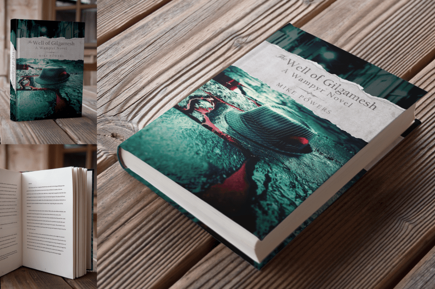
My second favorite did, in fact, come in second. The fedora in the blood-drenched alleyway with the torn cover was an early concept that I still love, and fully intend to use in terms of self-promotion (as is evident by my blog and twitter headers).

The “well” design on black was one of the first ideas that I had, and franky, I included that for sentimental reasons. I have a specific promo idea in mind for that graphic, but frankly, I didn’t really expect that place highly in the poll (third ain’t bad, though!).

The fedora in the alley with the blood-text was a decent fourth, and again, I feel it was the difficult-to-read “Gilgamesh” text that prevented that one from rating higher.

But the winner of the lot is the most shocking to me, being the simplest of the designs. I took inspiration from a couple of other book covers, both of which were equally simple, and utilized a minimalist’s color pallete. From a purely psychological standpoint, it makes sense. It’s not really a secret that in marketing the color red has long been used to garner attention. That was the design most commented on, with the comments typically being, “If I saw that on a book shelf, that’s the one I’d be drawn to.”

I still plan to create posters, postcards, and book marks as promotional material, so I have a feeling each of these designs will still see the light of day in one form or another. I want to take a moment to thank everyone for stopping by my blog or Instagram account to share your views and votes for this project. Again, I will elaborate on the nature and content of the book itself in the very near future. I have a little tweaking to do to the book cover before I go live, but I will let you all know when the book is finally available for purchase.

Until then, I encourage you to follow my blog, twitter, and instagram accounts. I’ll have an official author page on Facebook soon enough, as well as an offical website to promote my book. If everything works out, this will be my first of many novels. This is an exciting journey that I’m embarking upon, and I’m thrilled to have all of you along for the ride!


Judge My Book By Its Cover

I wrote a book.

The Well of Gilgamesh: A Wampyr Novel.

There’s so much I want to tell you about it–about its inception, about the blood, sweat, and tears that went into it. I want to tell you about the story itself, how it evolved, how it came to be what it is today. But before all of that, I need something from you.

Your judgment.

“Don’t judge a book by its cover,” they say. But that’s exactly what I’m asking of you. I’m going to give you a brief summary of the book, but other than that, I just want to show you a few cover designs. Below, you’ll find five different options that I designed, all of which speak to me on different levels in regards to the book’s content, and I want you–my friends, family, and virtual  acquaintances–to help me pick the best cover for my novel.

Which of these covers speaks to you the most? Which book, if you were to see it on the shelf at your favorite book store, would inspire you to reach out to it, to peek beneath the cover and inquire as to its contents?

After examining each of the five virtual mock-ups, at the bottom of the page you’ll see the poll. Simply click and submit. It really is that simple.

But first, here’s what it’s all about:

When Ayden finally has the chance to confront his obsessive fan—the man in the red-feathered fedora—he seizes it, though it may be the worse decision of his life. It isn’t long before a dark and deadly picture emerges; his were the stories whispered by candlelight, the reason darkness is feared. He calls himself Hendrik, and he is a vampire.
Hendrik claims lineage to a pre-Sumerian tribe of naturalists who discovered the key to perpetual life through artificial selection, splicing a new branch onto mankind’s evolutionary tree: a breed of humans born into darkness, fueled by bloodlust, and living the lives of gods, laying the groundwork for the earliest surviving work of literature, The Epic of Gilgamesh. Hendrik’s interest in Ayden is unclear, but when a centuries-old feud is reignited, a bloody turf war ensues and Ayden is unwittingly drawn into a nightmarish world of feral cannibals and preternatural carnage.
Set against the turbulent winter of Minnesota’s Twin Cities, The Well of Gilgamesh: A Wampyr Novel is a briskly paced story that combines ancient mythology and a remarkable modern scientific theory into a vivid and stirring tale of one vampire’s mysterious fixation on a local musician and another’s desire to repopulate the frozen metropolis with a new, deadlier breed of vampire.

And now, onto the covers. Behold…

Cover 1: Fedora, Blood TextCover 1 Mockup

Cover 2: Fedora, Torn PaperCover 2 Mockup

Cover 3: Blood Splatter on WhiteCover 3 Mockup

Cover 4: Stone WellCover 4 Mockup

Cover 5: Red Background (Modern, Minimalist)Cover 5 Mockup

OK, now that you’ve seen the concepts, take the following poll and let me know which is your favorite cover. Just click the button next to the cover that you like the best, then click VOTE at the bottom of the poll. Perhaps you’re torn between one design or another, and if that’s the case, by all means leave a comment. Your opinions are not only welcome, they’re encouraged! Some of you are my art and design comrades, so please, let the opinions fly! The results will be posted next week.

The release date for my novel will be posted within the next few weeks. Follow my blog to stay up to date. Feeling altruistic? By all means, tell EVERYONE YOU KNOW about my blog and my book! Thanks for stopping by!