And the Winner Is…

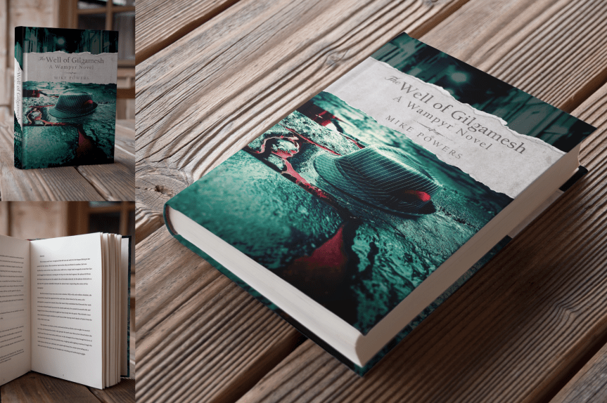
It looks as those Design #5 was the favorite! The results are posted below.

THE WINNER

Here are the results:

Results

I don’t mind telling you, I’m surprised by the results. I intentionally witheld my personal preferences so as not to skew the results, but my personal favorite (as well as that of my wife) came in last: the White cover. The response to that one seemed to be that the text was a tad difficult to read, which I understand.

My second favorite did, in fact, come in second. The fedora in the blood-drenched alleyway with the torn cover was an early concept that I still love, and fully intend to use in terms of self-promotion (as is evident by my blog and twitter headers).

The “well” design on black was one of the first ideas that I had, and franky, I included that for sentimental reasons. I have a specific promo idea in mind for that graphic, but frankly, I didn’t really expect that place highly in the poll (third ain’t bad, though!).

The fedora in the alley with the blood-text was a decent fourth, and again, I feel it was the difficult-to-read “Gilgamesh” text that prevented that one from rating higher.

But the winner of the lot is the most shocking to me, being the simplest of the designs. I took inspiration from a couple of other book covers, both of which were equally simple, and utilized a minimalist’s color pallete. From a purely psychological standpoint, it makes sense. It’s not really a secret that in marketing the color red has long been used to garner attention. That was the design most commented on, with the comments typically being, “If I saw that on a book shelf, that’s the one I’d be drawn to.”

I still plan to create posters, postcards, and book marks as promotional material, so I have a feeling each of these designs will still see the light of day in one form or another. I want to take a moment to thank everyone for stopping by my blog or Instagram account to share your views and votes for this project. Again, I will elaborate on the nature and content of the book itself in the very near future. I have a little tweaking to do to the book cover before I go live, but I will let you all know when the book is finally available for purchase.

Until then, I encourage you to follow my blog, twitter, and instagram accounts. I’ll have an official author page on Facebook soon enough, as well as an offical website to promote my book. If everything works out, this will be my first of many novels. This is an exciting journey that I’m embarking upon, and I’m thrilled to have all of you along for the ride!

Judge My Book By Its Cover

I wrote a book.

The Well of Gilgamesh: A Wampyr Novel.

There’s so much I want to tell you about it–about its inception, about the blood, sweat, and tears that went into it. I want to tell you about the story itself, how it evolved, how it came to be what it is today. But before all of that, I need something from you.

Your judgment.

“Don’t judge a book by its cover,” they say. But that’s exactly what I’m asking of you. I’m going to give you a brief summary of the book, but other than that, I just want to show you a few cover designs. Below, you’ll find five different options that I designed, all of which speak to me on different levels in regards to the book’s content, and I want you–my friends, family, and virtual  acquaintances–to help me pick the best cover for my novel.

Which of these covers speaks to you the most? Which book, if you were to see it on the shelf at your favorite book store, would inspire you to reach out to it, to peek beneath the cover and inquire as to its contents?

After examining each of the five virtual mock-ups, at the bottom of the page you’ll see the poll. Simply click and submit. It really is that simple.

But first, here’s what it’s all about:

When Ayden finally has the chance to confront his obsessive fan—the man in the red-feathered fedora—he seizes it, though it may be the worse decision of his life. It isn’t long before a dark and deadly picture emerges; his were the stories whispered by candlelight, the reason darkness is feared. He calls himself Hendrik, and he is a vampire.
Hendrik claims lineage to a pre-Sumerian tribe of naturalists who discovered the key to perpetual life through artificial selection, splicing a new branch onto mankind’s evolutionary tree: a breed of humans born into darkness, fueled by bloodlust, and living the lives of gods, laying the groundwork for the earliest surviving work of literature, The Epic of Gilgamesh. Hendrik’s interest in Ayden is unclear, but when a centuries-old feud is reignited, a bloody turf war ensues and Ayden is unwittingly drawn into a nightmarish world of feral cannibals and preternatural carnage.
Set against the turbulent winter of Minnesota’s Twin Cities, The Well of Gilgamesh: A Wampyr Novel is a briskly paced story that combines ancient mythology and a remarkable modern scientific theory into a vivid and stirring tale of one vampire’s mysterious fixation on a local musician and another’s desire to repopulate the frozen metropolis with a new, deadlier breed of vampire.

And now, onto the covers. Behold…

Cover 1: Fedora, Blood TextCover 1 Mockup

Cover 2: Fedora, Torn PaperCover 2 Mockup

Cover 3: Blood Splatter on WhiteCover 3 Mockup

Cover 4: Stone WellCover 4 Mockup

Cover 5: Red Background (Modern, Minimalist)Cover 5 Mockup

OK, now that you’ve seen the concepts, take the following poll and let me know which is your favorite cover. Just click the button next to the cover that you like the best, then click VOTE at the bottom of the poll. Perhaps you’re torn between one design or another, and if that’s the case, by all means leave a comment. Your opinions are not only welcome, they’re encouraged! Some of you are my art and design comrades, so please, let the opinions fly! The results will be posted next week.

The release date for my novel will be posted within the next few weeks. Follow my blog to stay up to date. Feeling altruistic? By all means, tell EVERYONE YOU KNOW about my blog and my book! Thanks for stopping by!

The Fearless T-Rex

This is just a fun image I threw together a few years back. It started as part of a daily drawing exercise on the website CGSociety about eight years ago (I believe it was CGTalk Daily Drawing Challenge, or something).Dino Sketch 
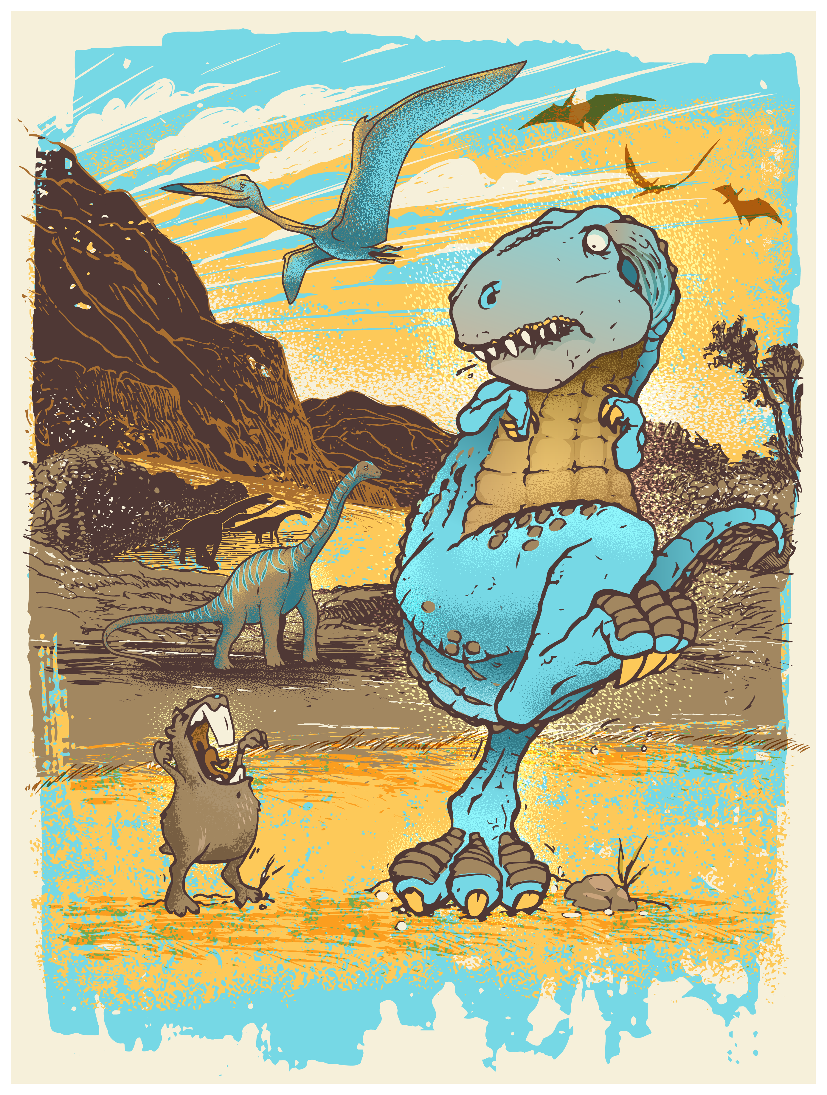
I really don’t recall what the theme was; probably to add a new spin to Jurassic Park, or some such thing. Regardless, the initial sketch stayed tucked away in my digital archives until just a couple of years ago when I stumbled upon it and decided it needed a refresher. And since my twin boys happen to have walls in their bedroom that were severely lacking in decor, I decided this would be the perfect opportunity to rectify that (by turning it into a sublimated print). A few embelishments and splashes of color later and voilà: Guinea Pigadon vs. T-Rex. I actually just made that title up. Like, as I typed. Before now it was just called “dino poster.” My creativity knows no bounds.

Dino Poster

That’s it for today. Love to hear what you think. Are you a follower of my blog yet? Perhaps you should be. Think about that, will you? It’s a cool place to hang. Bring a friend. Beer is in the fridge.

Lite ‘Em Up Washington

Last, but not least, Lite ‘Em Up Washington! (Again, check the first post for details on this set of posters). This was not on the commission list. In the late summer of 2015, I moved from the Twin Cities to the Seattle area, and in light of the move, I decided to do a version of the Cheech and Chong poster for the great state of Washington. It’s particularly appropriate since Washington is one of the few states where the recreational use of marijuana is actaully LEGAL. Not that I partake–it’s just not for me–but I will absolutely defend anyone’s right to do so. I’ve said it before; toke ’em if you got ’em.

If you live in the Seattle area and you’re not a Seahawks fan, shame on you. At least, that’s what any Seahawks fan will tell you. Seriously. I thought Vikings fans were obsessive. Anyway, I figured I better incorporate the Seahawks colors into this one. A couple other icons of Seattle include Pike Place Market with their recognizable signage, the Space Needle (of course), and Seattle’s very own Nirvana (and it’s always cloudy in Seattle). And of course, since this is the only one of the designs I’ve done where it’s actually legal to toke in the given location, I had to include the tagline, “IT’S THE LAW.” Let’s just say that it wasn’t difficult to turn this one into a location-specific poster.

CC WA Poster

I particularly enjoy the smoking salmon bong that Chong is holding. Get it? Smoked salmon? Puns are great, aren’t they?

And that’s all she wrote. As I mentioned when I posted the first of these designs, the final concept that they ended up using was a very neutral version of my original concept, so these more elaborate versions never saw the light of day. Sad, I know. But that’s why I’m sharing them here. Who knows, though. Maybe they’ll decide to revisit them and we’ll get to actually print some of these. One can only hope. But I have plenty of other designs to share, and I’m constantly creating more. And check back soon, as my big vampire reveal is just around the corner!

Lite ‘Em Up Nebraska

Number four in my Cheech and Chong poster series (which all began here).

This one went through a few changes before we settled on this design. Initially Cheech wore an oversized cowboy hat, similar to the Nebraska Husker‘s mascot, Herbie Husker, but that was deemed too proprietary. I think they could have gotten away with it (I left off the “N” and used a slightly different style of hat), but it’s not my decision. I’m happy with the trucker’s hat with the embroidered pot leaf, so this works, too. Personally, I really like Chong‘s corncob pipe and country-boy bibs. Yee-haw.

CC NE Poster

I’ll keep this one nice and short; you’re coming here for the images, after all. This particular design resonated with me, only because my hometown highschool team utilized the same school colors, along with the “N” (Nashua Bulldogs–GO BIG RED!), and Nashua, Iowa, is smack dab in the middle of northeast Iowa’s farming country. Maybe I’ll tweak this in the future to “Lite ‘Em Up Nashua.” Maybe.

One more left, and the next one is just a design I did for fun. Come on back now, ya hear!

Light ‘Em Up Kansas

I took a break from my Cheech and Chong posts yesterday to address a weighty issue. The gravity of the situation demanded it. Personally, I feel the post was loaded with brilliance. It was, dare I say, genuis. But I’ve wasted enough time discussing the past. And though time is relative, I feel we should move on.

Rock, Chalk, Lite ‘Em Up!

The third of my Cheech and Chong posters is for the state of Kansas (see the story behind the posters here).

I don’t want to lie to you, my wonderful and trusting readers; I do not follow many (or more accurately any) sports. But as my boss informed me as I was originally working on this one, the University of Kansas Jayhawks fans have a “Rock Chalk Chant” that they, well, chant at Jayhawks games. I’m not going to go into details here. If you’re interested in that, check their wiki. Regardless, it seemed appropriate enough to incorporate into the design.

Since I don’t follow sports, I struggled with how to make this one appropriately “sports-related” to a local Kansas team, so I basically made Cheech and Chong look like obsessed fans, with a team-colored wig and painted face (along with the outline of the state of Kansas behind them).

CC KS Poster

I don’t really know if this would resonate with Jayhawks fans, but I find it wonderfully amusing. I hope you do to. That’s all for now. Two left, so check back soon!

Heavy…

Did you hear the news? Gravitational waves, Einstein’s ripples in spacetime, have been spotted for the first time! Do you know what this means? Neither do I! But it sounds cool as sh*t and the scientific world is all kinds of excited about it. And rightfully so. Science effing rocks. I skimmed the article that I linked to above, but the TV was on and I was having a hard time focusing, so I retained very little of what was written. But I’m pretty sure the gist of it is, we’re finally going to figure out how to bring Sam Beckett home. Hang in there, Al!

So two things have been going through my head since I first read about the gravitational waves. The first is the song by Modest Mouse, Gravity Rides Everything. The second thing is, along with the Cheech and Chong graphics that I’ve previously posted (and will continue to post), I also designed a few Einstein themed t-shirts and beanies. So I’m taking a break from the Cheech and Chong posts and tossing ol’ Einie into the mix. Einie. That’s what people called him, right? Anyway, here’s a couple graphics that I threw together for American Mills, International about a year ago. I modified them for the sake of this post beacuse that’s what I do.

Mi Einstein Poster 01

See that? I even incorporated Modest Mouse’s song title into the graphic. Clever, I know. Here’s the other one.

Mi Einstein Poster 02

That’s about it for today. Pretty simple. I’ll leave you with a clip of Gravity Rides Everything, because, Modest Mouse. Cheers.


Lite ‘Em Up Wisconsin

The second in my Cheech and Chong series (see the first one here, along with an explaination, if interested).

For this image, I masked the counter-culture icons within the outline of the state of Wisconsin, gave Cheech a green-leather flyer’s hat, and put a blue cheese wheel on Chong‘s head, in lieu of the copyrighted Cheesehead wedge so popular among Green Bay Packers‘ fans. Interestingly enough, through my research for blue cheese graphics I learned that “blue cheese” is a type of high-quality cannabis, making this tweak on the cheesehead quite apropos.

CC WI Poster

I have about three more of these, so stay tuned. As previously stated, these were a blast to work on, so I hope you enjoy seeing what I’ve come up with. Comment now, comment often, and follow my blog to stay up to date on all of my mental musings!

Lite ‘Em Up Minnesota

Cheech and Chong; the ultimate counter-culture dynamic duo. I have a childhood friend named Jessy to thank for introducing me to Cheech and Chong movies as a child, via his uncle Rocky. I remember spending the night at Jessy’s grandmother’s place, staying up until the late hours of the night drinking Pepsi® from the glass bottles, eating Doritos®, and watching his uncle Rocky’s Cheech and Chong video collection. I had no idea what I was watching, but I knew it was funny as sh*t.

Fast-forward about thirty years, and I find myself working on some Cheech and Chong designs for American Mills International, a company licensed to create an assortment of food products and garments for a variety of celebrities and pop-culture icons, like Larry the Cable Guy, Marilyn Monroe, and Einstein, just to name diverse a few.

The initial goal of this project was to sell these tees in specific markets, geared mainly towards the local sports enthusiasts by way of team color association. They wanted “goof” images of Cheech and Chong, somehow displaying a form of local pride (e.g., for Minnesota, Cheech was originally wearing a Viking’s horned helmet, and for Wisconsin, Chong was wearing a Cheese Head). The downfall was, we got a little too close for comfort in regards to licensing infringement in the respective areas. So modifications were made, as shown in the designs to follow.

This first one is for Lite ‘Em Up Minnesota. Instead of showing it as a tee, I decided to turn it into a poster, because, frankly, that’s more fun.

CC MN Poster.png

Layered over the state outline of Minnesota and painted with a semblence of the team colors of the Minnesota Vikings, I added the skyline of Minneapolis at the base of Cheech and Chong, gave Chong a purple tie and camouflage bandana, and dressed Cheech in a beanie resembling a Helga Hat. This design, as well as those to follow, were well-received by the client, though ultimately they decided for a far simpler concept: a neutral design consisting of a basic name-drop combined with a single splash of color to accomodate the various locations. The t-shirt shown below is the final approved design.

CC MN Tee

I had a great deal of fun working on this. I was given considerbale freedom on the designs and the client seemed to eat them up–even though they did end up using the simplified versions. I’ll post a few more in the days to come, most of which are officially in the slush pile (since, as stated above, they were far too location-specific to mass-produce as “name drop” designs).

So stay tuned, be good, and toke ’em if you got ’em. (Don’t forget to check back often, as my “big vampire reveal” is just around the corner!)

Bowling for Boobs 2015

About a year ago I posted a graphic that I had done for a breast cancer awareness t-shirt (which I turned into a poster for the sake of the post, which you can view here). That was the 2014 design. In 2015 I was asked to do a follow-up. Since the pin-up image went over so well with the client, I decided to revisit the style with the new design.

The following is the first draft that I provided (again, I turned it into a poster for the sake of this post). An element I focused on for this version was to make the pose of the model line up with the ribbon. I’m happy with how it turned out, though I acknowledge that there’s something a tad awkward about her stance.

BfB_01

They liked it–at first–but then someone suggested that the bowler should be more retro. I found a relatively poor-quality piece of clip art to start from, tweaked it here, modified it there, and turned it into this, the second draft. Pretty much the same as the first, just with a 70s era bowler in place of the 50s pin-up. Her pose is more natural than my first attempt, while keeping within the shape of the ribbon, which I like.

BfB_02

Again, they liked it, but ultimately decided to do away with the female graphic altogether. I’m fine with the final product, but I liked the first couple drafts better, so I thought I’d share them all.

BfB_FINAL

As with the 2014 version, the style of these designs were HEAVILY influenced by the work of Twin Cities-based screen print designer–as well as bicycle and beer enthusiast–Adam Turman. If you’re unfamiliar with his work, I highly recommend browsing his website. As before, any similarities between this set of images and his work is entirely intentional. One of these days I’ll stop with this fan-boy mimicry and design something purely my own for one of these breast cancer tees. But I find that not only is imitation the most sincere form of flattery, it’s also a great way to learn.

I’d love to hear what you think of my designs. Let me know if you have a favorite, and stay tuned for more digital illustrations.

One final note: research toward the eradication of all types of cancer is a worthy, yet expensive cause. If you’re able, please visit The American Cancer Society and donate today. A diagnosis of cancer no longer has to be a death-sentence, but we have a long way to go before the battle is won. Until next time…