Drawn to the Vampire, Part 1

In light of the recent release of my first vampire novel, I thought I’d do a series of illustrations showcasing my favorite pop-culture vampires.

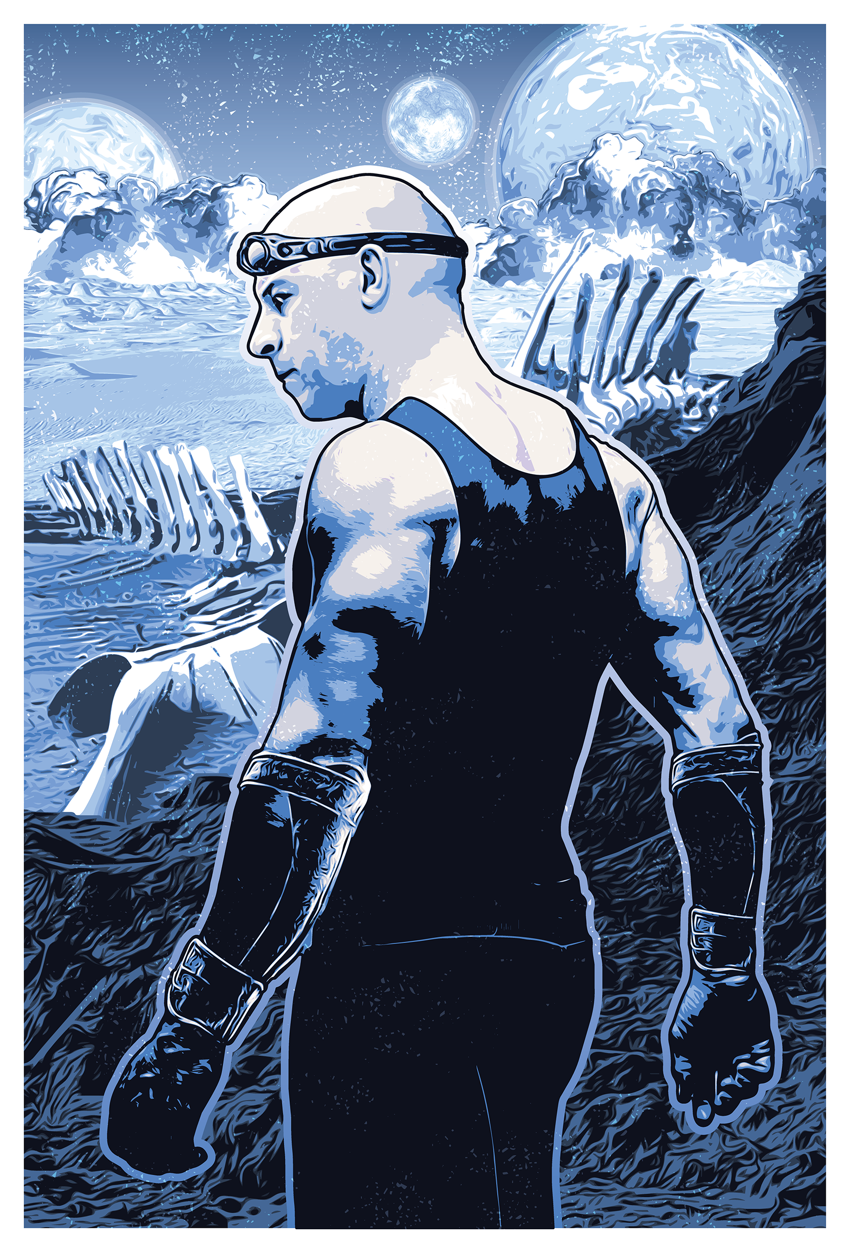
The first on my list does not come from a traditional vampire series, rather he’s a prominent character in an urban fantasy series by author Kevin Hearne called The Iron Druid Chronicles. The main character in the series is the charismatic, if often sarcastic ancient druid, Atticus O’Sullivan (born Siodhachan O Suileabhain–find someone who speaks Old Irish to pronounce that one for you). Despite being human, he’s managed to survive for more than 2,000 years through the help of his own herbal concoction of Immortali-Tea® which he also provides to his faithful Irish Wolfhound companion, Oberon (Oberon even has his own Twitter account. Seriously. Check it out). Assisting Atticus in his legal needs is an attorney by the name of Leif Helgarson, who happens to be–you guessed it–a vampire (come on–he’s a lawyer; he was either going to be a vampire or a land shark, and this ain’t no SNL sketch).

Leif Helgarson

Mi Vampire_Leif Helgarson

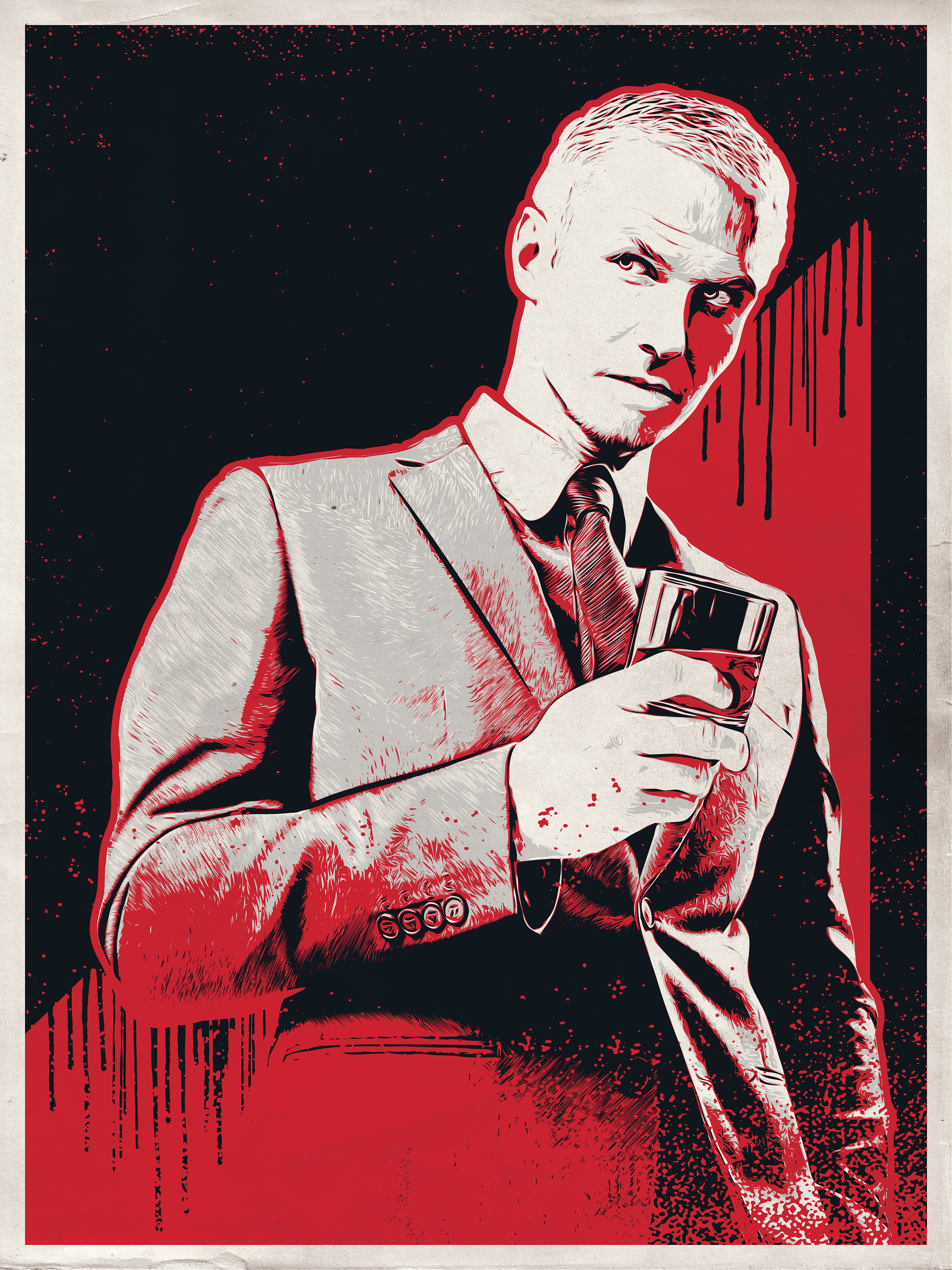
As his name suggests, Leif is of Scandanavian decent. More specifically, he was born a Viking. After his family was murdered by Thor (yeah–that Thor–turns out he was kind of a dick), Leif went in search of a vampire who could embrace him, so he’d have the strength and power to take his vengeance on the old Norse god. His first wish came true–he became a vampire. But he’d have to chill a few centuries before he could face the king of dude-bros in battle. As it turned out, he needed help to traverse the godly planes to Valhalla, and so he secretly buddied up to a druid named Atticus, pretending to be his friend for as long as it suited his needs.

That’s as far as I’ll go with his backstory. After all, I don’t want to spoil it for you. If you haven’t read The Iron Druid Chronicles, I suggest you look into them. They’re action-packed and laced with wonderfully dark and sarcastic humor (something Hearne has a gift for). For the sake of this illustration, I deferred to his description in the books; he’s a sophisticated gent, prone to wearing high-quality suits and is fond of well-aged beverages (his favorite drink of choice is a vintage 2,000-year-old blend–the blood of his old pal, Atticus). And while he lives in modern times, he’s never quite adjusted to the era, having a tendency to speak in a lyrical prose more suited to a Shakespearian play. He makes for a fun and interesting character to read about, and I look forward to seeing more of him in Hearne’s novels.

Much like Neil Gaiman‘s American Gods, the Iron Druid Chronicles are packed full of gods from pantheons worldwide, both past and present. These assorted gods attain their strength through the power of faith (they exist as the result of belief itself, and the more people who believe in/worship them, the stronger they become). Atticus O’Sullivan is among the few beings capable of traveling back and forth between the godly realms, and unfortunately for him (or perhaps fortunately for us), he has a habit of causing a bit of mischief wherever his sandal-clad feet may take him. Hounded is the first in the Iron Druid Chronicles, and is a great place to start, available at Amazon.com. If you’re like me and a fan of audiobooks, voice actor Luke Daniels does an incredible job with the series over at Audible.com (highly recommended).

That’s it for today, folks. Short and sweet. Check back soon for Part 2 of my Drawn to the Vampire series.

Lite ‘Em Up Washington

Last, but not least, Lite ‘Em Up Washington! (Again, check the first post for details on this set of posters). This was not on the commission list. In the late summer of 2015, I moved from the Twin Cities to the Seattle area, and in light of the move, I decided to do a version of the Cheech and Chong poster for the great state of Washington. It’s particularly appropriate since Washington is one of the few states where the recreational use of marijuana is actaully LEGAL. Not that I partake–it’s just not for me–but I will absolutely defend anyone’s right to do so. I’ve said it before; toke ’em if you got ’em.

If you live in the Seattle area and you’re not a Seahawks fan, shame on you. At least, that’s what any Seahawks fan will tell you. Seriously. I thought Vikings fans were obsessive. Anyway, I figured I better incorporate the Seahawks colors into this one. A couple other icons of Seattle include Pike Place Market with their recognizable signage, the Space Needle (of course), and Seattle’s very own Nirvana (and it’s always cloudy in Seattle). And of course, since this is the only one of the designs I’ve done where it’s actually legal to toke in the given location, I had to include the tagline, “IT’S THE LAW.” Let’s just say that it wasn’t difficult to turn this one into a location-specific poster.

CC WA Poster

I particularly enjoy the smoking salmon bong that Chong is holding. Get it? Smoked salmon? Puns are great, aren’t they?

And that’s all she wrote. As I mentioned when I posted the first of these designs, the final concept that they ended up using was a very neutral version of my original concept, so these more elaborate versions never saw the light of day. Sad, I know. But that’s why I’m sharing them here. Who knows, though. Maybe they’ll decide to revisit them and we’ll get to actually print some of these. One can only hope. But I have plenty of other designs to share, and I’m constantly creating more. And check back soon, as my big vampire reveal is just around the corner!

Lite ‘Em Up Nebraska

Number four in my Cheech and Chong poster series (which all began here).

This one went through a few changes before we settled on this design. Initially Cheech wore an oversized cowboy hat, similar to the Nebraska Husker‘s mascot, Herbie Husker, but that was deemed too proprietary. I think they could have gotten away with it (I left off the “N” and used a slightly different style of hat), but it’s not my decision. I’m happy with the trucker’s hat with the embroidered pot leaf, so this works, too. Personally, I really like Chong‘s corncob pipe and country-boy bibs. Yee-haw.

CC NE Poster

I’ll keep this one nice and short; you’re coming here for the images, after all. This particular design resonated with me, only because my hometown highschool team utilized the same school colors, along with the “N” (Nashua Bulldogs–GO BIG RED!), and Nashua, Iowa, is smack dab in the middle of northeast Iowa’s farming country. Maybe I’ll tweak this in the future to “Lite ‘Em Up Nashua.” Maybe.

One more left, and the next one is just a design I did for fun. Come on back now, ya hear!

Lite ‘Em Up Minnesota

Cheech and Chong; the ultimate counter-culture dynamic duo. I have a childhood friend named Jessy to thank for introducing me to Cheech and Chong movies as a child, via his uncle Rocky. I remember spending the night at Jessy’s grandmother’s place, staying up until the late hours of the night drinking Pepsi® from the glass bottles, eating Doritos®, and watching his uncle Rocky’s Cheech and Chong video collection. I had no idea what I was watching, but I knew it was funny as sh*t.

Fast-forward about thirty years, and I find myself working on some Cheech and Chong designs for American Mills International, a company licensed to create an assortment of food products and garments for a variety of celebrities and pop-culture icons, like Larry the Cable Guy, Marilyn Monroe, and Einstein, just to name diverse a few.

The initial goal of this project was to sell these tees in specific markets, geared mainly towards the local sports enthusiasts by way of team color association. They wanted “goof” images of Cheech and Chong, somehow displaying a form of local pride (e.g., for Minnesota, Cheech was originally wearing a Viking’s horned helmet, and for Wisconsin, Chong was wearing a Cheese Head). The downfall was, we got a little too close for comfort in regards to licensing infringement in the respective areas. So modifications were made, as shown in the designs to follow.

This first one is for Lite ‘Em Up Minnesota. Instead of showing it as a tee, I decided to turn it into a poster, because, frankly, that’s more fun.

CC MN Poster.png

Layered over the state outline of Minnesota and painted with a semblence of the team colors of the Minnesota Vikings, I added the skyline of Minneapolis at the base of Cheech and Chong, gave Chong a purple tie and camouflage bandana, and dressed Cheech in a beanie resembling a Helga Hat. This design, as well as those to follow, were well-received by the client, though ultimately they decided for a far simpler concept: a neutral design consisting of a basic name-drop combined with a single splash of color to accomodate the various locations. The t-shirt shown below is the final approved design.

CC MN Tee

I had a great deal of fun working on this. I was given considerbale freedom on the designs and the client seemed to eat them up–even though they did end up using the simplified versions. I’ll post a few more in the days to come, most of which are officially in the slush pile (since, as stated above, they were far too location-specific to mass-produce as “name drop” designs).

So stay tuned, be good, and toke ’em if you got ’em. (Don’t forget to check back often, as my “big vampire reveal” is just around the corner!)

Bowling for Boobs 2015

About a year ago I posted a graphic that I had done for a breast cancer awareness t-shirt (which I turned into a poster for the sake of the post, which you can view here). That was the 2014 design. In 2015 I was asked to do a follow-up. Since the pin-up image went over so well with the client, I decided to revisit the style with the new design.

The following is the first draft that I provided (again, I turned it into a poster for the sake of this post). An element I focused on for this version was to make the pose of the model line up with the ribbon. I’m happy with how it turned out, though I acknowledge that there’s something a tad awkward about her stance.

BfB_01

They liked it–at first–but then someone suggested that the bowler should be more retro. I found a relatively poor-quality piece of clip art to start from, tweaked it here, modified it there, and turned it into this, the second draft. Pretty much the same as the first, just with a 70s era bowler in place of the 50s pin-up. Her pose is more natural than my first attempt, while keeping within the shape of the ribbon, which I like.

BfB_02

Again, they liked it, but ultimately decided to do away with the female graphic altogether. I’m fine with the final product, but I liked the first couple drafts better, so I thought I’d share them all.

BfB_FINAL

As with the 2014 version, the style of these designs were HEAVILY influenced by the work of Twin Cities-based screen print designer–as well as bicycle and beer enthusiast–Adam Turman. If you’re unfamiliar with his work, I highly recommend browsing his website. As before, any similarities between this set of images and his work is entirely intentional. One of these days I’ll stop with this fan-boy mimicry and design something purely my own for one of these breast cancer tees. But I find that not only is imitation the most sincere form of flattery, it’s also a great way to learn.

I’d love to hear what you think of my designs. Let me know if you have a favorite, and stay tuned for more digital illustrations.

One final note: research toward the eradication of all types of cancer is a worthy, yet expensive cause. If you’re able, please visit The American Cancer Society and donate today. A diagnosis of cancer no longer has to be a death-sentence, but we have a long way to go before the battle is won. Until next time…


Drawn to the Bad Guy, Part 1

The concept of being drawn to the villain is nothing new, and I’m certainly not going to get into why it happens here. You’re not coming to my blog for a crash course in psychology and I am certainly not qualified to be doling out such info. But what I can do is discuss my favorite pop-culture villains. And I figured what better way to do that than to make a top 5 list. I thought about typing a simple list and finishing with an illustration I did, but then I started thinking about the individual villains that I chose, and thought, why not do five different blog posts, highlighting an illustration with each? So, without further ado, here’s number five on my list.

5. Riddick

For the sake of this list, I’m strictly referring to Vin Diesel‘s character Riddick from the movie Pitch Black. I enjoyed his subsequent films (the animated movie The Chronicles of Riddick: Dark FuryThe Chronicles of Riddick, and Riddick), but none of the sequels came anywhere near the artistic atmosphere of the movie that introduced us to the character. And to be fair, Riddick wasn’t technically a villain so much as a just really bad dude. But for at least part of the film we’re left wondering what his motives are; for part of the film we’re forced to question whether or not he actually is a villainous character. So that’s good enough for me.

What is it about him? Don’t know. He’s a violent character, cares about no one but himself, and yet he redeems himself at the end letting us know there’s still some good left in him. Is it the redemption that I’m drawn to? Perhaps. Though not necessarily. Some of the baddies that will follow on my list certainly fail in their redemption. Perhaps it’s his devil-may-care attitude, or moreover, the “I’m badder than the devil” attitude (yes, I know, “badder” isn’t a word–when you’re as bad as Riddick you don’t care about no stinkin’ grammar). Aesthetically speaking, I definitely dug the shiner eyes they gave him (in Pitch Black he indicates that while stuck in a prison where he never saw daylight, he paid a back-alley surgeon to perform a surgical shine-job on his eyes, giving him night vision), along with the steampunk goggles he had to wear during daylight hours. He was resourceful and clearly intelligent, which definitely added to the appeal. He figured out how to deal with the aliens that were attacking the group before anyone else did, and he was the only one who could successfully bypass them and escape the bizarre planet that they’d crash landed on. Should I have said “spoiler alert?” Ah, well. Here’s the illustration.

Mi Riddick Pitch Black

Just a quick note–the landscape, as well as Riddick’s attire, are not necessarily accurate to the movie Pitch Black. I was more going for atmosphere and general feel rather than 100% accuracy.

That’s it for today. Come back next week, same bat-time, same bat-channel for the next installment of “Who are Mikey’s favorite bad guys!”