Heavy…

Did you hear the news? Gravitational waves, Einstein’s ripples in spacetime, have been spotted for the first time! Do you know what this means? Neither do I! But it sounds cool as sh*t and the scientific world is all kinds of excited about it. And rightfully so. Science effing rocks. I skimmed the article that I linked to above, but the TV was on and I was having a hard time focusing, so I retained very little of what was written. But I’m pretty sure the gist of it is, we’re finally going to figure out how to bring Sam Beckett home. Hang in there, Al!

So two things have been going through my head since I first read about the gravitational waves. The first is the song by Modest Mouse, Gravity Rides Everything. The second thing is, along with the Cheech and Chong graphics that I’ve previously posted (and will continue to post), I also designed a few Einstein themed t-shirts and beanies. So I’m taking a break from the Cheech and Chong posts and tossing ol’ Einie into the mix. Einie. That’s what people called him, right? Anyway, here’s a couple graphics that I threw together for American Mills, International about a year ago. I modified them for the sake of this post beacuse that’s what I do.

Mi Einstein Poster 01

See that? I even incorporated Modest Mouse’s song title into the graphic. Clever, I know. Here’s the other one.

Mi Einstein Poster 02

That’s about it for today. Pretty simple. I’ll leave you with a clip of Gravity Rides Everything, because, Modest Mouse. Cheers.


Lite ‘Em Up Minnesota

Cheech and Chong; the ultimate counter-culture dynamic duo. I have a childhood friend named Jessy to thank for introducing me to Cheech and Chong movies as a child, via his uncle Rocky. I remember spending the night at Jessy’s grandmother’s place, staying up until the late hours of the night drinking Pepsi® from the glass bottles, eating Doritos®, and watching his uncle Rocky’s Cheech and Chong video collection. I had no idea what I was watching, but I knew it was funny as sh*t.

Fast-forward about thirty years, and I find myself working on some Cheech and Chong designs for American Mills International, a company licensed to create an assortment of food products and garments for a variety of celebrities and pop-culture icons, like Larry the Cable Guy, Marilyn Monroe, and Einstein, just to name diverse a few.

The initial goal of this project was to sell these tees in specific markets, geared mainly towards the local sports enthusiasts by way of team color association. They wanted “goof” images of Cheech and Chong, somehow displaying a form of local pride (e.g., for Minnesota, Cheech was originally wearing a Viking’s horned helmet, and for Wisconsin, Chong was wearing a Cheese Head). The downfall was, we got a little too close for comfort in regards to licensing infringement in the respective areas. So modifications were made, as shown in the designs to follow.

This first one is for Lite ‘Em Up Minnesota. Instead of showing it as a tee, I decided to turn it into a poster, because, frankly, that’s more fun.

CC MN Poster.png

Layered over the state outline of Minnesota and painted with a semblence of the team colors of the Minnesota Vikings, I added the skyline of Minneapolis at the base of Cheech and Chong, gave Chong a purple tie and camouflage bandana, and dressed Cheech in a beanie resembling a Helga Hat. This design, as well as those to follow, were well-received by the client, though ultimately they decided for a far simpler concept: a neutral design consisting of a basic name-drop combined with a single splash of color to accomodate the various locations. The t-shirt shown below is the final approved design.

CC MN Tee

I had a great deal of fun working on this. I was given considerbale freedom on the designs and the client seemed to eat them up–even though they did end up using the simplified versions. I’ll post a few more in the days to come, most of which are officially in the slush pile (since, as stated above, they were far too location-specific to mass-produce as “name drop” designs).

So stay tuned, be good, and toke ’em if you got ’em. (Don’t forget to check back often, as my “big vampire reveal” is just around the corner!)

Bowling for Boobs 2015

About a year ago I posted a graphic that I had done for a breast cancer awareness t-shirt (which I turned into a poster for the sake of the post, which you can view here). That was the 2014 design. In 2015 I was asked to do a follow-up. Since the pin-up image went over so well with the client, I decided to revisit the style with the new design.

The following is the first draft that I provided (again, I turned it into a poster for the sake of this post). An element I focused on for this version was to make the pose of the model line up with the ribbon. I’m happy with how it turned out, though I acknowledge that there’s something a tad awkward about her stance.

BfB_01

They liked it–at first–but then someone suggested that the bowler should be more retro. I found a relatively poor-quality piece of clip art to start from, tweaked it here, modified it there, and turned it into this, the second draft. Pretty much the same as the first, just with a 70s era bowler in place of the 50s pin-up. Her pose is more natural than my first attempt, while keeping within the shape of the ribbon, which I like.

BfB_02

Again, they liked it, but ultimately decided to do away with the female graphic altogether. I’m fine with the final product, but I liked the first couple drafts better, so I thought I’d share them all.

BfB_FINAL

As with the 2014 version, the style of these designs were HEAVILY influenced by the work of Twin Cities-based screen print designer–as well as bicycle and beer enthusiast–Adam Turman. If you’re unfamiliar with his work, I highly recommend browsing his website. As before, any similarities between this set of images and his work is entirely intentional. One of these days I’ll stop with this fan-boy mimicry and design something purely my own for one of these breast cancer tees. But I find that not only is imitation the most sincere form of flattery, it’s also a great way to learn.

I’d love to hear what you think of my designs. Let me know if you have a favorite, and stay tuned for more digital illustrations.

One final note: research toward the eradication of all types of cancer is a worthy, yet expensive cause. If you’re able, please visit The American Cancer Society and donate today. A diagnosis of cancer no longer has to be a death-sentence, but we have a long way to go before the battle is won. Until next time…


Drawn to the Bad Guy, Part 4

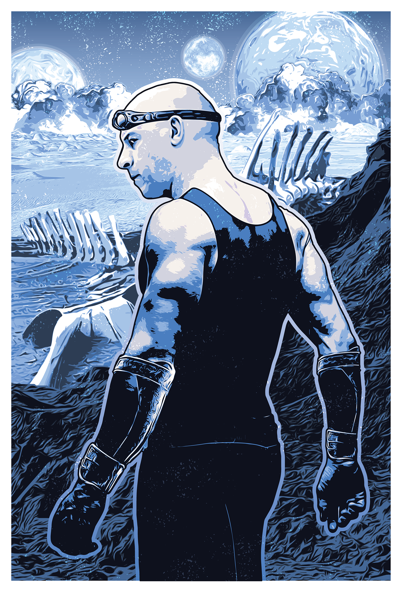
From the Clown Prince to the Brat Prince…

Let me start out by saying, no offense intended to Tom Cruise. I enjoyed the movie Interview With A Vampire; it’s among my favorite vampire flicks, and Tom Cruise portrayed the character brilliantly. But in regards to my fondness for this particular character, it’s the version from the novels that I’m drawn to as opposed to the theatrical representation. And honestly, for the sake of this illustration, my main issue with Tom Cruise stems from his success; he simply has too recognizable of a face. Yes, he played the character quite well, but if I used his version of the character for my illustration, I wouldn’t be drawing the character, I’d be drawing Tom Cruise. That’s a rough problem to have, Mr. Cruise; you’re more than an actor, you’re an icon. OK, enough about that. On to number two on my list…

2. Lestat de Lioncourt

The Vampire Lestat. As with Riddick, who started this list at number five, Lestat isn’t necessarily a villain, though if you now of him only from Anne Rice‘s premier vampire novel, Interview With a Vampire, you might have been led to believe otherwise. He was somewhat detestable in that novel (as was he in the movie), truly living up to his title of the “Brat Prince.” And if you only know him from that novel, you’re missing out. The Vampire Lestat was the second book in Anne Rice’s Vampire Chronicles, and she approached it as though he wrote the book himself. In it, he was able to give his side to the story, and we got to know Lestat in a whole new light (or lack thereof, as it were). Still among my favorite vampire novels of all time.

According to Anne Rice, her visual of her favorite creation was a young Rutger Hauer. In her own words, as posted on her Facebook page celebrating Rutger Hauer’s 71st birthday,
…for me, Hauer was the spitting image of ‘The Vampire Lestat.’ You want to know what Lestat looks like to me? Look at this photograph. I didn’t base Lestat’s description on Hauer. I didn’t encounter him till after I’d written ‘Interview with the Vampire’ in which Lestat sprang to life  pretty much on his own. But this is surely how I see my beloved Brat Prince hero.” By the time Interview With a Vampire made it to the big screen, Rutger Hauer was too old to play the bratty protagonist. Which is unfortunate, because his skill as not only an actor but with improvisation would have made him so perfect for the role. But, as the French-born Lestat would say, c’est la vie.

And since that is how Anne Rice visualizes her own character, I decided I’d better base my illustration on Hauer, as well. Placing him in a Victorian-style painting just seemed like a no-brainer. Can’t you picture this hanging in Louis de Pointe du Lac’s plantation home?

Mi Lestat

Once again, I had a great deal of fun putting this one together. Despite both Tom Cruise and Stuart Townsend putting a face to the name (Townsend portrayed Lestat in the 2002 film version of Queen of the Damned), for the most, part it’s left to the reader to create their own mental image. And while Rice did provide a template by naming Hauer as a model, it was still on me to bring him to life. I actually had the most trouble with his complexion; I almost made his flesh white, but that seemed too unnatural, and not in a good way. Ultimately I feel like the subtle ruddy tint I added was just enough to make him look only somewhat unnatural, or rather the right amount of preternatural, without looking like a statue.

One quick note before I go. In the course of putting together this digital illustration, I’ve learned that Anne Rice has been experiencing some medical issues, which she discusses briefly on her Facebook page. As a long-time fan, I just wanted to take a moment to wish her all the best for a speedy recovery. Get well soon, Anne!

And that was number two on my list. Number one was actually the first of the illustrations that I did in this series, but being my favorite baddie, I wanted to save him for last. So stay tuned, I’ll be posting him real soon. And now that I’m done with Lestat, I’ve been inspired to do another list. In the near future, I’ll be putting together a list of my top 10 favorite vampires, complete with illustrations like these. And you can be certain Lestat will still be on that list–with a new interpretation, of course. Until then…

Ha! I bet you thought I wasn’t going to mention my own upcoming vampire project. Well, I did. Just now. But there’ll be more fanfare when the time draws near. See what I did there? “Draws” near. A pun. Laters.

Drawn to the Bad Guy, Part 1

The concept of being drawn to the villain is nothing new, and I’m certainly not going to get into why it happens here. You’re not coming to my blog for a crash course in psychology and I am certainly not qualified to be doling out such info. But what I can do is discuss my favorite pop-culture villains. And I figured what better way to do that than to make a top 5 list. I thought about typing a simple list and finishing with an illustration I did, but then I started thinking about the individual villains that I chose, and thought, why not do five different blog posts, highlighting an illustration with each? So, without further ado, here’s number five on my list.

5. Riddick

For the sake of this list, I’m strictly referring to Vin Diesel‘s character Riddick from the movie Pitch Black. I enjoyed his subsequent films (the animated movie The Chronicles of Riddick: Dark FuryThe Chronicles of Riddick, and Riddick), but none of the sequels came anywhere near the artistic atmosphere of the movie that introduced us to the character. And to be fair, Riddick wasn’t technically a villain so much as a just really bad dude. But for at least part of the film we’re left wondering what his motives are; for part of the film we’re forced to question whether or not he actually is a villainous character. So that’s good enough for me.

What is it about him? Don’t know. He’s a violent character, cares about no one but himself, and yet he redeems himself at the end letting us know there’s still some good left in him. Is it the redemption that I’m drawn to? Perhaps. Though not necessarily. Some of the baddies that will follow on my list certainly fail in their redemption. Perhaps it’s his devil-may-care attitude, or moreover, the “I’m badder than the devil” attitude (yes, I know, “badder” isn’t a word–when you’re as bad as Riddick you don’t care about no stinkin’ grammar). Aesthetically speaking, I definitely dug the shiner eyes they gave him (in Pitch Black he indicates that while stuck in a prison where he never saw daylight, he paid a back-alley surgeon to perform a surgical shine-job on his eyes, giving him night vision), along with the steampunk goggles he had to wear during daylight hours. He was resourceful and clearly intelligent, which definitely added to the appeal. He figured out how to deal with the aliens that were attacking the group before anyone else did, and he was the only one who could successfully bypass them and escape the bizarre planet that they’d crash landed on. Should I have said “spoiler alert?” Ah, well. Here’s the illustration.

Mi Riddick Pitch Black

Just a quick note–the landscape, as well as Riddick’s attire, are not necessarily accurate to the movie Pitch Black. I was more going for atmosphere and general feel rather than 100% accuracy.

That’s it for today. Come back next week, same bat-time, same bat-channel for the next installment of “Who are Mikey’s favorite bad guys!”