Bowling for Boobs 2015

About a year ago I posted a graphic that I had done for a breast cancer awareness t-shirt (which I turned into a poster for the sake of the post, which you can view here). That was the 2014 design. In 2015 I was asked to do a follow-up. Since the pin-up image went over so well with the client, I decided to revisit the style with the new design.

The following is the first draft that I provided (again, I turned it into a poster for the sake of this post). An element I focused on for this version was to make the pose of the model line up with the ribbon. I’m happy with how it turned out, though I acknowledge that there’s something a tad awkward about her stance.

BfB_01

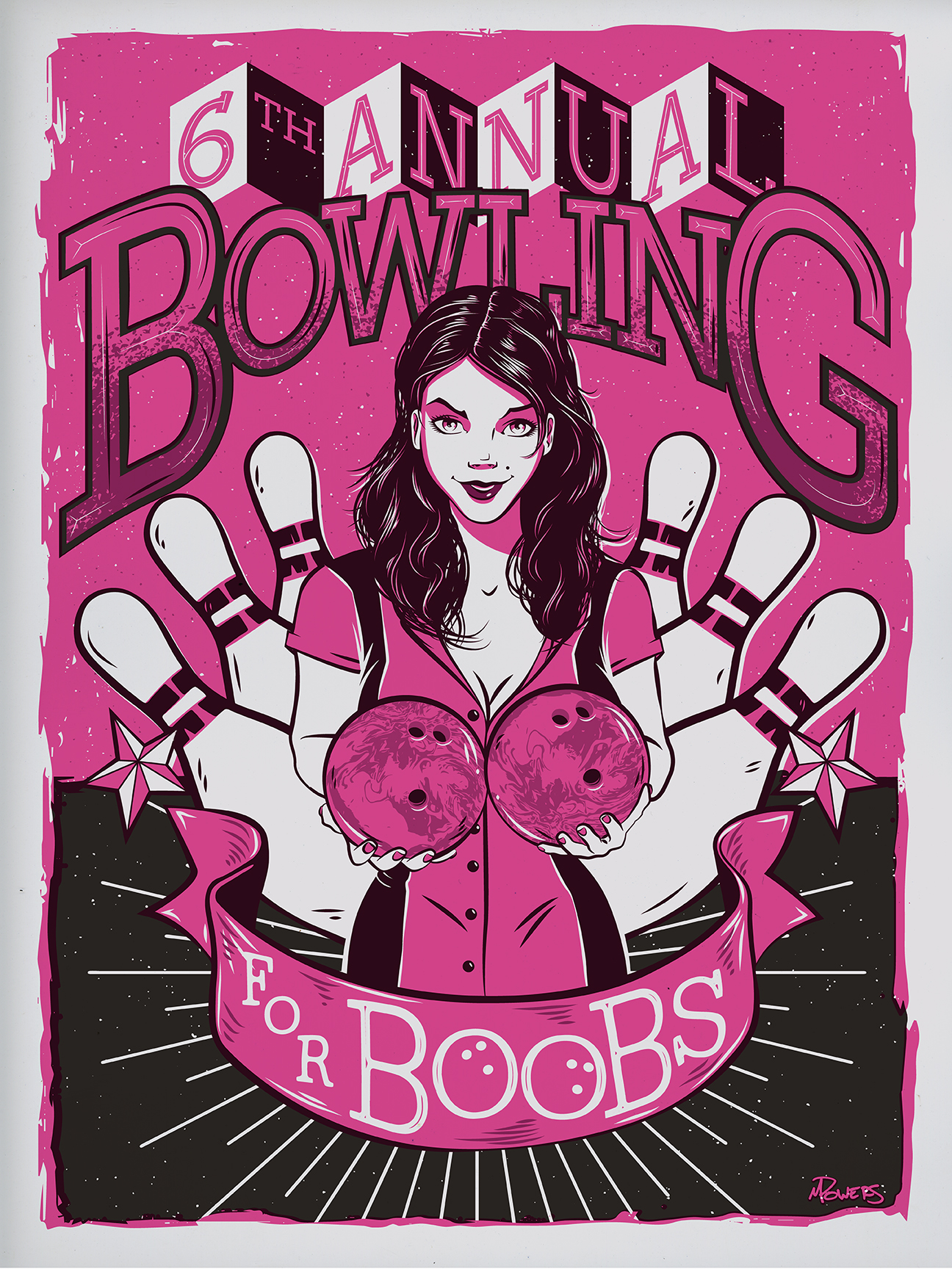
They liked it–at first–but then someone suggested that the bowler should be more retro. I found a relatively poor-quality piece of clip art to start from, tweaked it here, modified it there, and turned it into this, the second draft. Pretty much the same as the first, just with a 70s era bowler in place of the 50s pin-up. Her pose is more natural than my first attempt, while keeping within the shape of the ribbon, which I like.

BfB_02

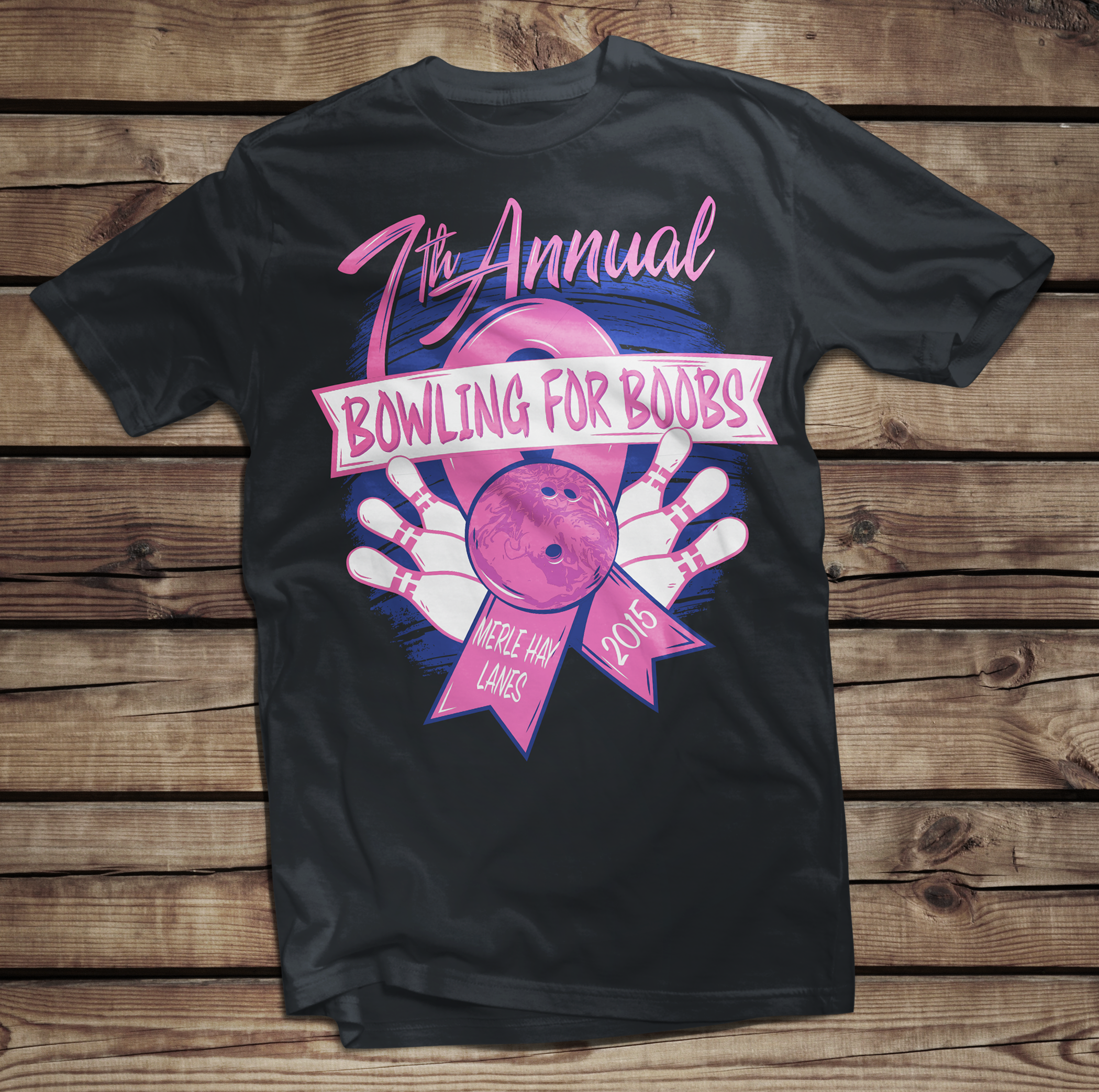
Again, they liked it, but ultimately decided to do away with the female graphic altogether. I’m fine with the final product, but I liked the first couple drafts better, so I thought I’d share them all.

BfB_FINAL

As with the 2014 version, the style of these designs were HEAVILY influenced by the work of Twin Cities-based screen print designer–as well as bicycle and beer enthusiast–Adam Turman. If you’re unfamiliar with his work, I highly recommend browsing his website. As before, any similarities between this set of images and his work is entirely intentional. One of these days I’ll stop with this fan-boy mimicry and design something purely my own for one of these breast cancer tees. But I find that not only is imitation the most sincere form of flattery, it’s also a great way to learn.

I’d love to hear what you think of my designs. Let me know if you have a favorite, and stay tuned for more digital illustrations.

One final note: research toward the eradication of all types of cancer is a worthy, yet expensive cause. If you’re able, please visit The American Cancer Society and donate today. A diagnosis of cancer no longer has to be a death-sentence, but we have a long way to go before the battle is won. Until next time…


Drawn to the Bad Guy, Part 1

The concept of being drawn to the villain is nothing new, and I’m certainly not going to get into why it happens here. You’re not coming to my blog for a crash course in psychology and I am certainly not qualified to be doling out such info. But what I can do is discuss my favorite pop-culture villains. And I figured what better way to do that than to make a top 5 list. I thought about typing a simple list and finishing with an illustration I did, but then I started thinking about the individual villains that I chose, and thought, why not do five different blog posts, highlighting an illustration with each? So, without further ado, here’s number five on my list.

5. Riddick

For the sake of this list, I’m strictly referring to Vin Diesel‘s character Riddick from the movie Pitch Black. I enjoyed his subsequent films (the animated movie The Chronicles of Riddick: Dark FuryThe Chronicles of Riddick, and Riddick), but none of the sequels came anywhere near the artistic atmosphere of the movie that introduced us to the character. And to be fair, Riddick wasn’t technically a villain so much as a just really bad dude. But for at least part of the film we’re left wondering what his motives are; for part of the film we’re forced to question whether or not he actually is a villainous character. So that’s good enough for me.

What is it about him? Don’t know. He’s a violent character, cares about no one but himself, and yet he redeems himself at the end letting us know there’s still some good left in him. Is it the redemption that I’m drawn to? Perhaps. Though not necessarily. Some of the baddies that will follow on my list certainly fail in their redemption. Perhaps it’s his devil-may-care attitude, or moreover, the “I’m badder than the devil” attitude (yes, I know, “badder” isn’t a word–when you’re as bad as Riddick you don’t care about no stinkin’ grammar). Aesthetically speaking, I definitely dug the shiner eyes they gave him (in Pitch Black he indicates that while stuck in a prison where he never saw daylight, he paid a back-alley surgeon to perform a surgical shine-job on his eyes, giving him night vision), along with the steampunk goggles he had to wear during daylight hours. He was resourceful and clearly intelligent, which definitely added to the appeal. He figured out how to deal with the aliens that were attacking the group before anyone else did, and he was the only one who could successfully bypass them and escape the bizarre planet that they’d crash landed on. Should I have said “spoiler alert?” Ah, well. Here’s the illustration.

Mi Riddick Pitch Black

Just a quick note–the landscape, as well as Riddick’s attire, are not necessarily accurate to the movie Pitch Black. I was more going for atmosphere and general feel rather than 100% accuracy.

That’s it for today. Come back next week, same bat-time, same bat-channel for the next installment of “Who are Mikey’s favorite bad guys!”

Bowling for Boobs

Just a quick post to show a design I did for Bowling for Boobs (#bowlingforboobs). Numerous groups take part in events such as this one in an attempt to raise awareness for breast cancer research. This illustration started as a t-shirt design, and I decided to expand upon it and turn it into a poster.

While this design is my own creation, it was heavily influenced by the work of Adam Turman, a local Twin Cities muralist and poster designer whose work I’m quite fond of. If you’re a cyclist or beer enthusiast in the Minneapolis/St. Paul area, you’re no doubt familiar with his work. Any similarities between this image and his posters are completely intentional. You might even call this fan art.

I have a friend and neighbor who is a breast cancer survivor, and for the past couple of years she’s participated in a local Relay for Life. Visit the American Cancer Society’s Relay for Life website if you’re interested in donating to the cause.

As always, I’d love to hear what you think. Follow now, comment often, and check back soon to see more of my work!

Bowling for Boobs